AccountTECH Blog
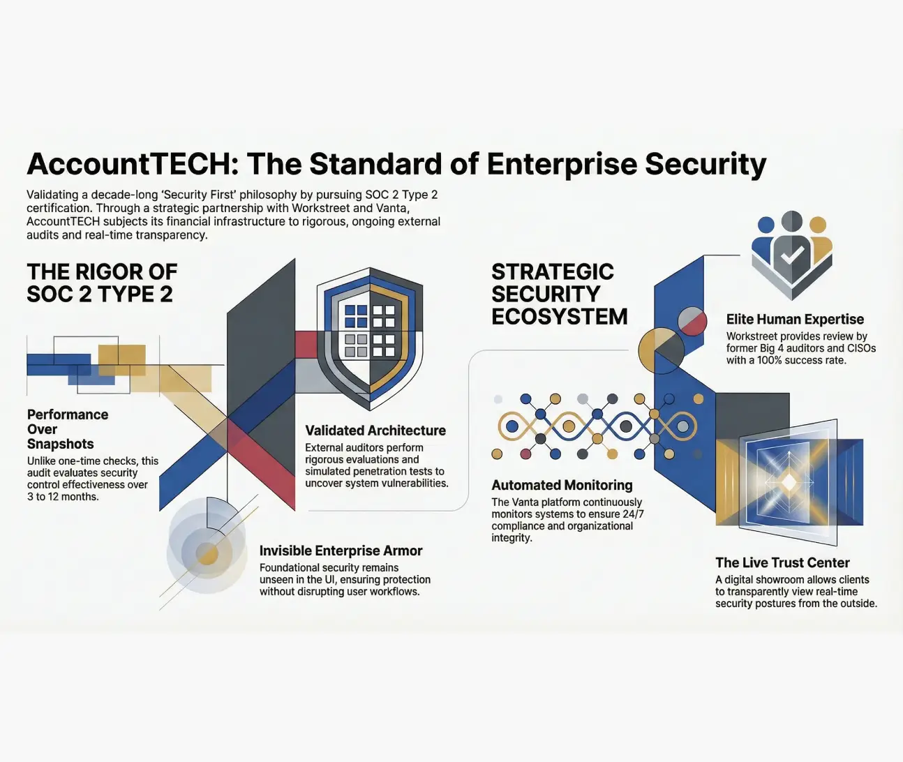
AccountTECH builds on a decade of "security first" design by partnering with workstreet for SOC 2 type 2 certification
for the last 10 years, AccountTech has made a “security first” approach the absolute foundation of their company policy, infrastructure, and architectural design.
AccountTECH joins leadingre’s solutions group — what it means for modern brokerages
when you’ve been in real estate since 1994, you’ve seen the cycles. the booms, the corrections, the tech waves, the “next big thing.”
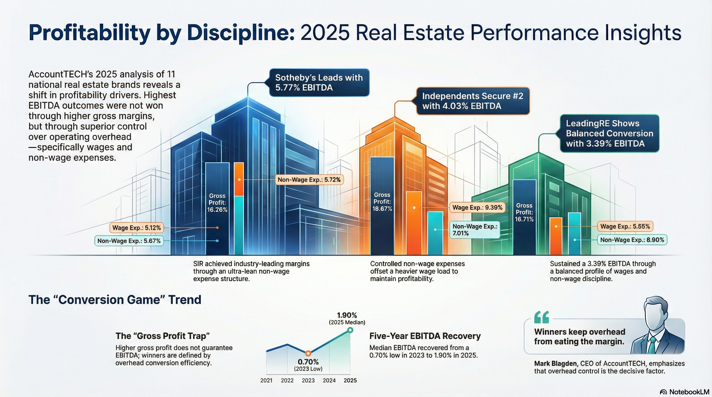
sotheby’s international realty leads the way in profitability for 2025
study finds leadership is won in overhead discipline—not gross margins; independent brokerages and leadingre round out the top three.
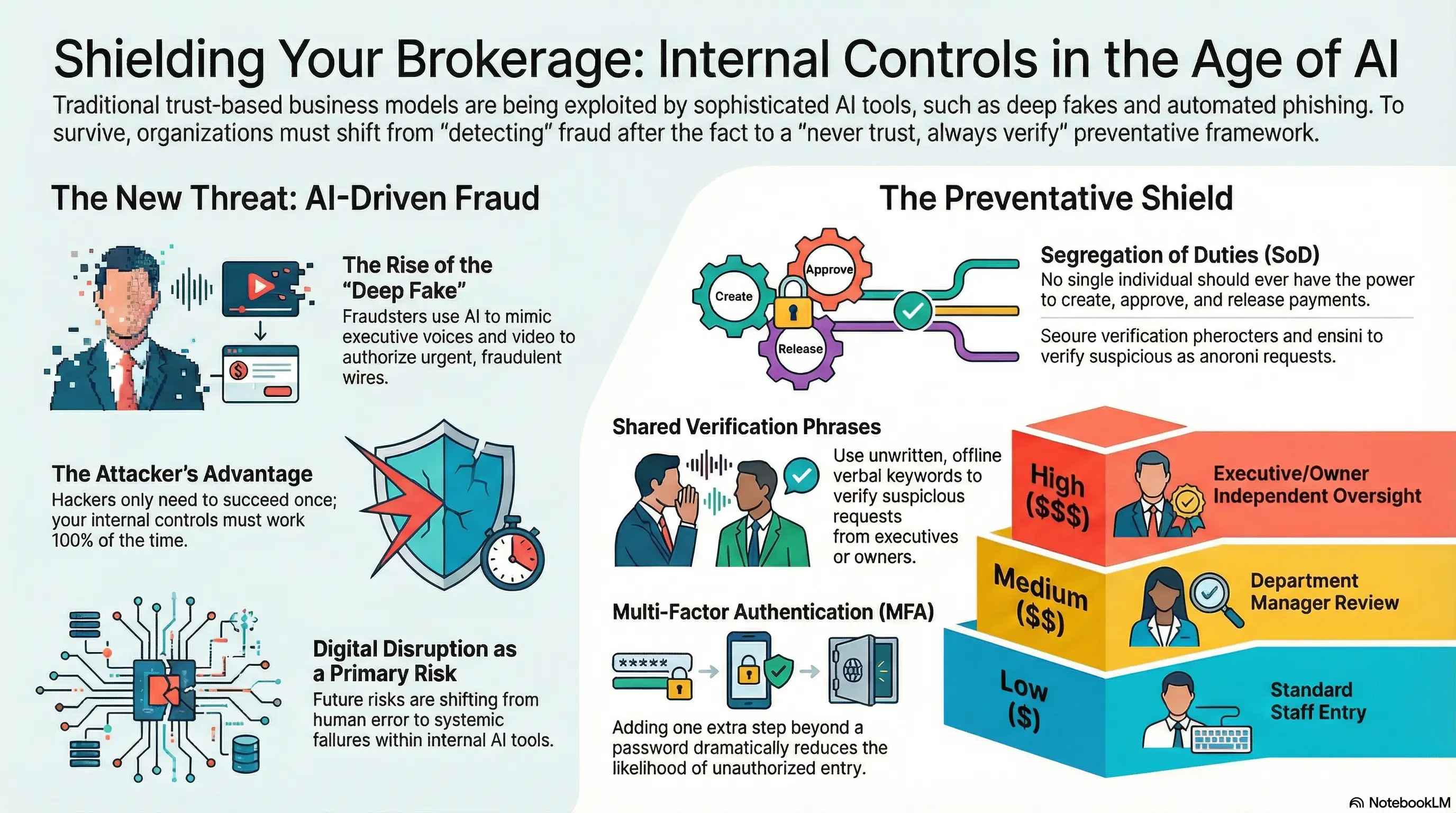
in the age of ai-driven fraud, trust is no longer enough
artificial intelligence is transforming business operations at record speed. but it’s also transforming fraud.
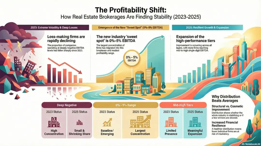
accounttech research: profitability is spreading across real estate brokerages
fewer firms are losing money — and more are reaching sustainable ebitda ranges. today accounttech released new industry research analyzing the distribution of ebitda performance across real estate brokerages, revealing a decisive shift in industry financial health over the past three years.
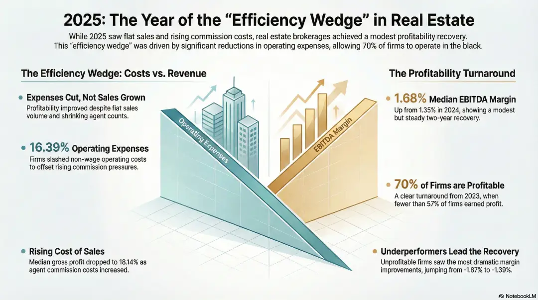
new research finds brokerages regain some profitability in 2025, largely by cutting costs
expense reductions, not sales growth, drove modest improvement as more firms moved back into the black. real estate brokerages across the united states showed signs of improving profitability in 2025, according to new benchmark research released this week by AccountTECH. the study, which analyzed financial results from 157 brokerage companies, found that profit margins improved modestly compared with 2024, largely because firms reduced expenses rather than grew revenue.
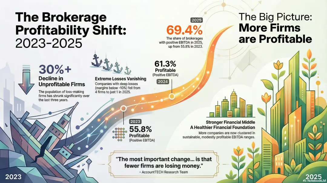
AccountTECH research shows steady increase in profitable brokerages
nearly 70% of firms generated positive EBITDA in 2025, up sharply from 2023. AccountTECH today released new findings from its annual brokerage financial benchmark research, revealing a significant and sustained improvement in the percentage of real estate brokerages operating with positive EBITDA.
gross margin index october 2025
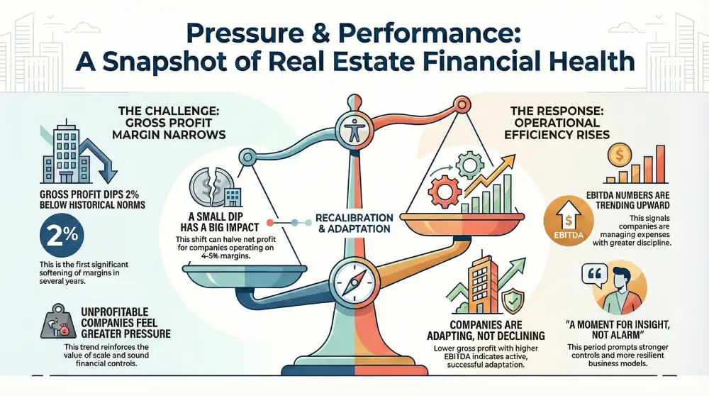
margins under pressure, efficiency on the rise: what recent gross profit trends are telling the industry. recent findings from accounttech’s ongoing industry study show a nuanced financial picture for real estate companies: gross profit margins have remained about 2% below historical norms for two consecutive months, while ebitda performance continues to strengthen. together, these trends point to a period of adjustment—one that brings both challenges and opportunities.

Mark Blagden, ceo of AccountTECH, is on the 2026 swanepoel power 200 list
AccountTECH announced today that Mark Blagden, the company’s ceo, has been named to the 2026 swanepoel power 200. this year, he is ranked 188th on the list of the most powerful leaders in residential real estate and marks the first time AccountTECH and Mark have been recognized on this prestigious list.
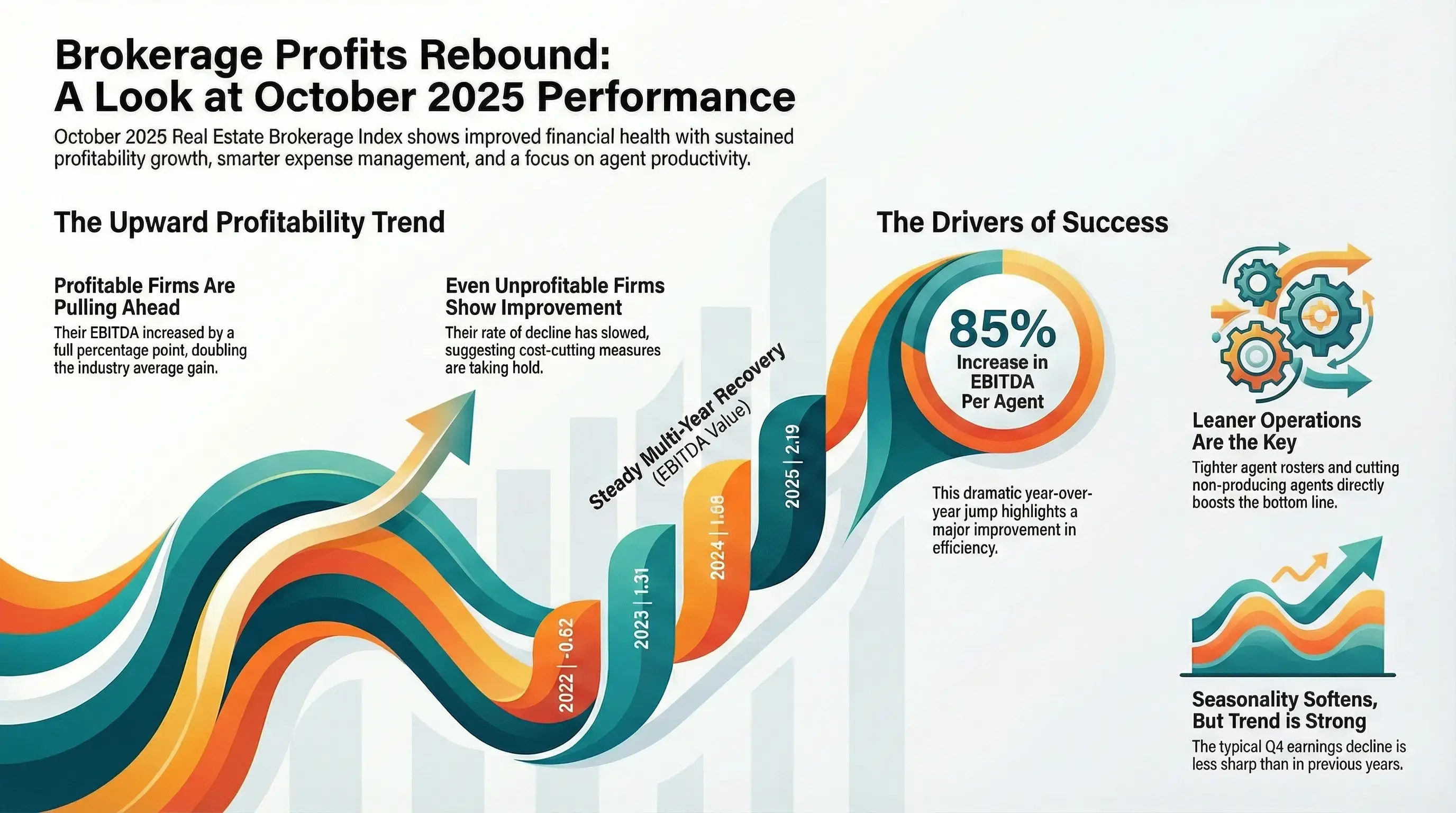
EBITDA margin index october 2025

AccountTECH AI advisory panel: shaping a smarter 2026
redesigning darwin.Cloud: we need your input
darwin.Cloud has consistently been designed with our users in mind, and now we’re going one step further. we need you to participate in the evolution of darwin.Cloud. your suggestions, comments, and originality will have a direct impact on how our platform is designed going forward.
why Cloud now: intercompany billing
overview of darwin.Cloud's intercompany billing streamline complex financial operations and manage transactions between your company's entities.
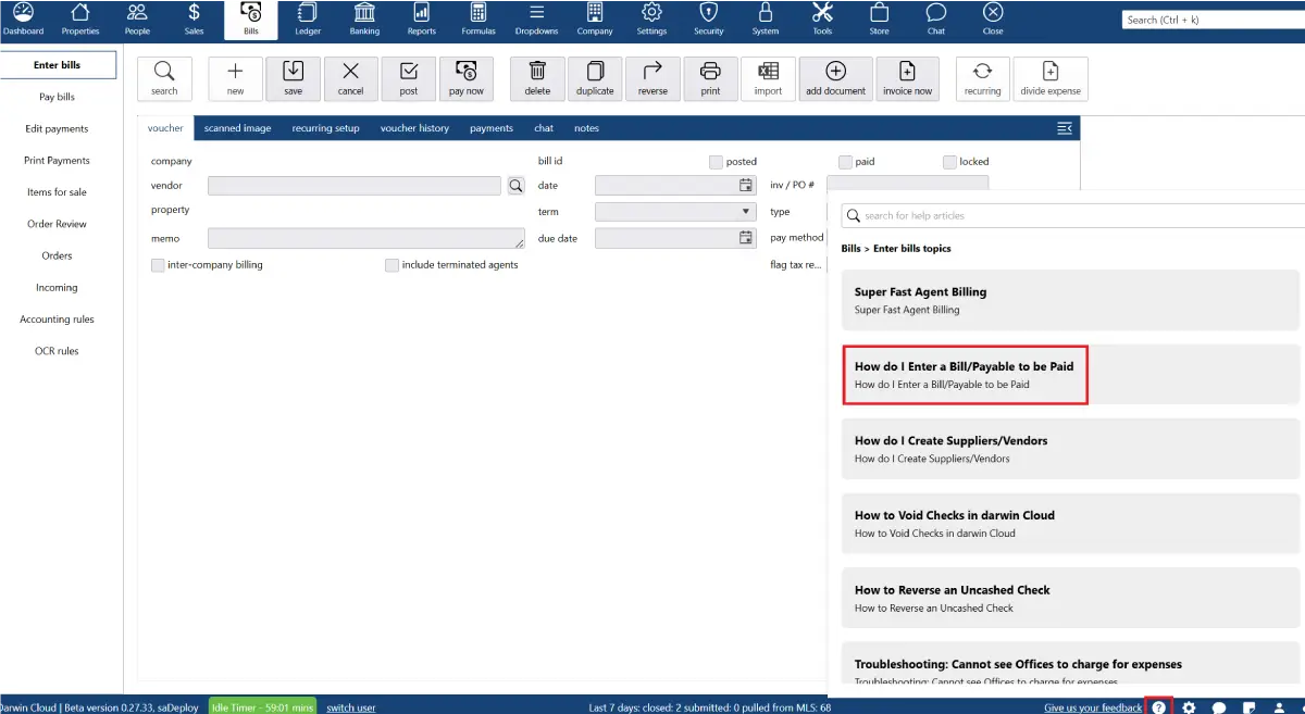
why Cloud now: context aware help
overview of darwin.Cloud’s context-aware help streamlining workflows, reducing support requests, and empowering users with instant guidance.
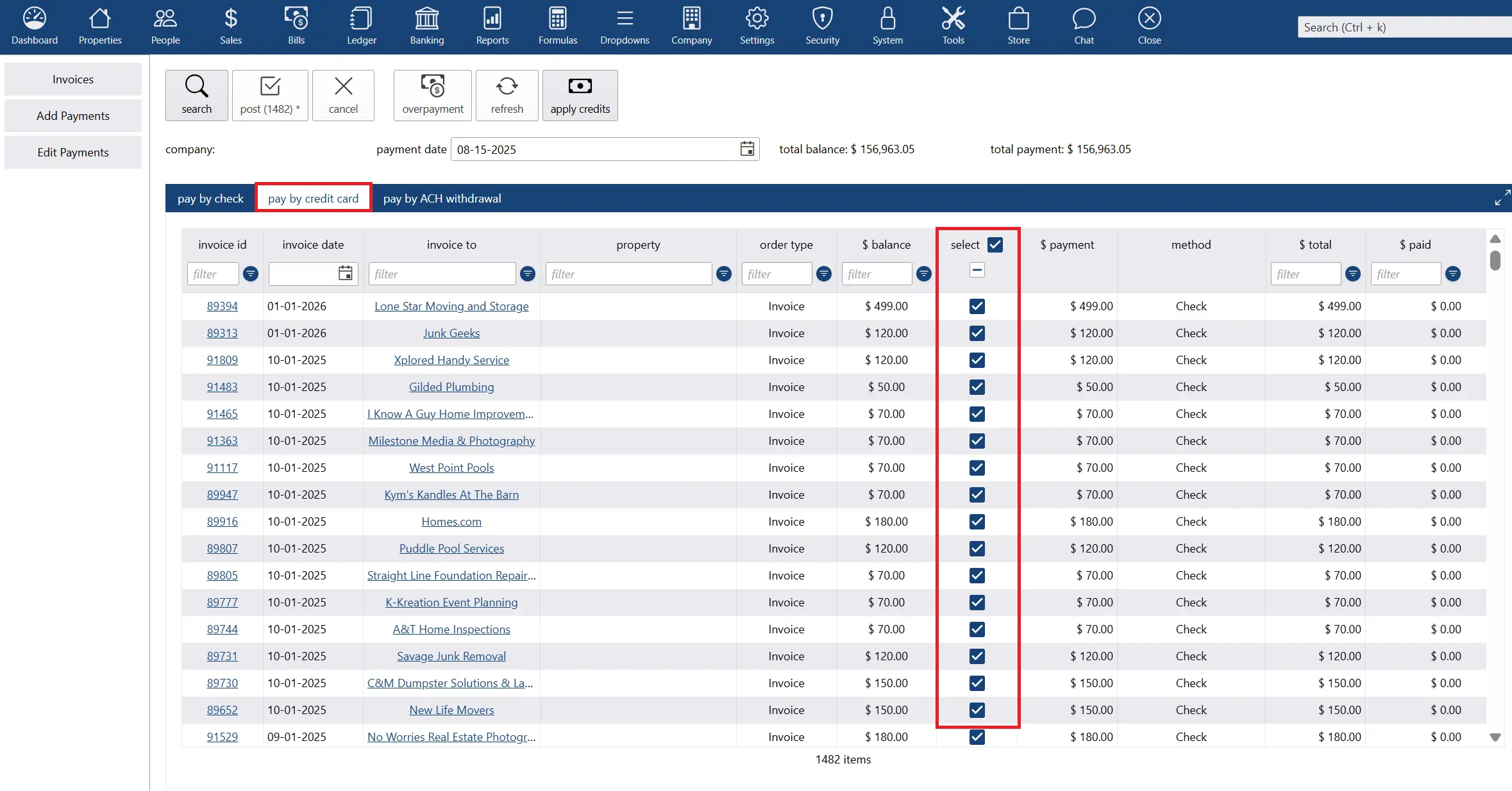
why Cloud now: ACH/direct deposit/credit card integration
overview of darwin.Cloud's ACH, direct deposit, and credit card integration for faster transactions, simplified agent payments, and secure financial management.
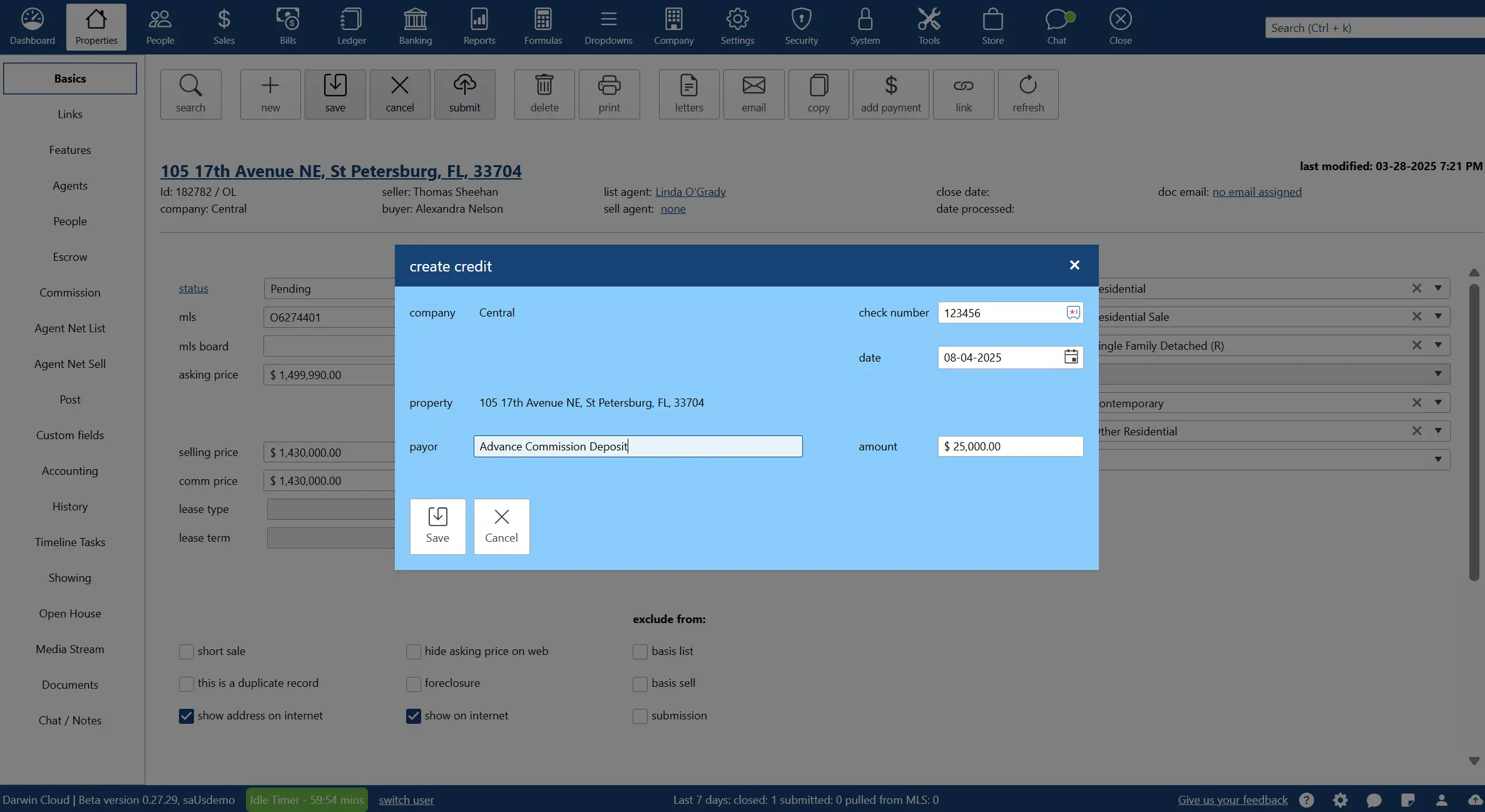
why Cloud now: record advance commission deposits
overview of darwin.Cloud's record advance commission deposits feature for improved cash flow management and streamlined payment processing.
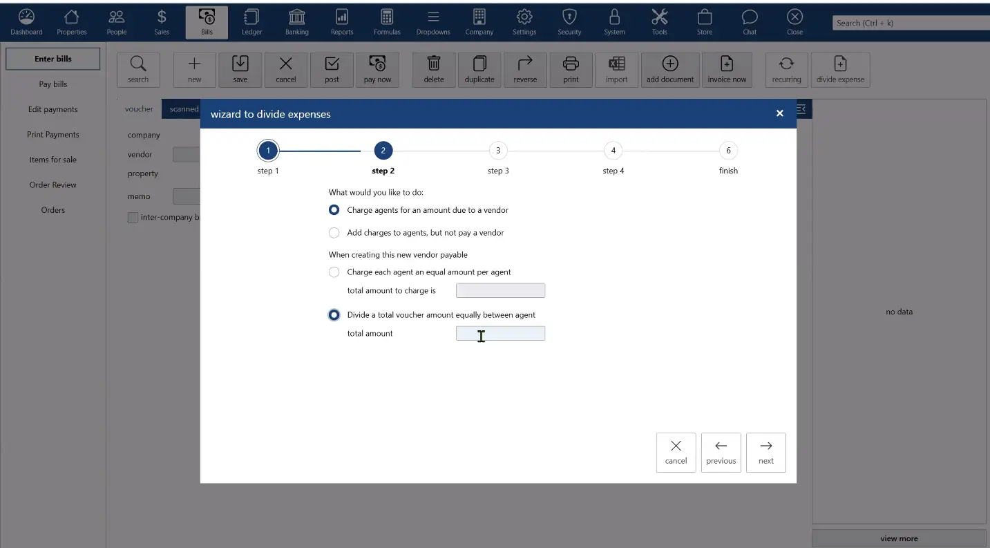
why Cloud now: divide expense wizard and billing groups
overview of darwin.Cloud's divide expense wizard and billing groups for automated expense allocation and improved cost management.
why Cloud now: agent reimbursable charges
overview of darwin.Cloud's agent reimbursable charges for efficient expense tracking, automated reimbursements, and agent satisfaction.
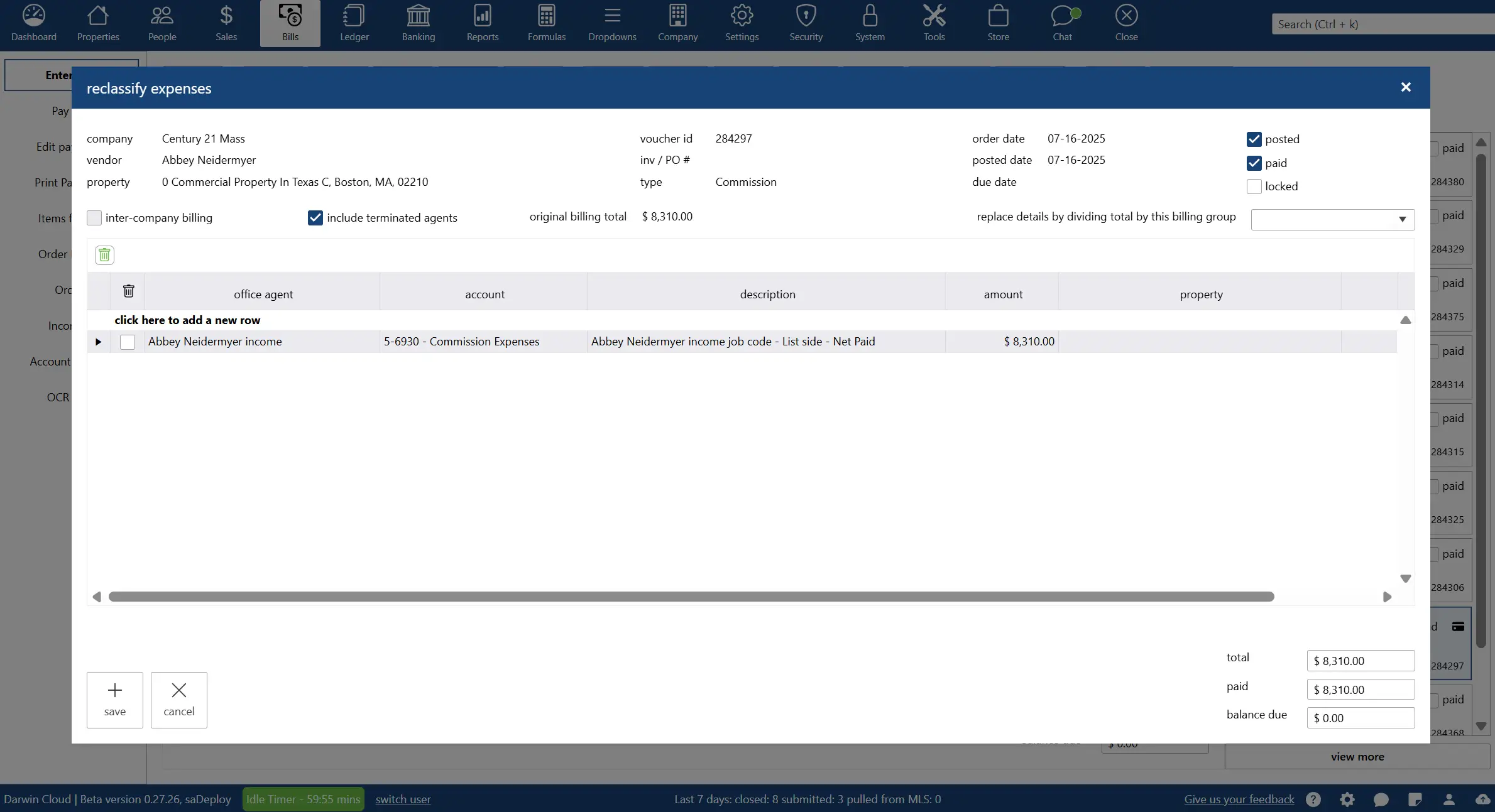
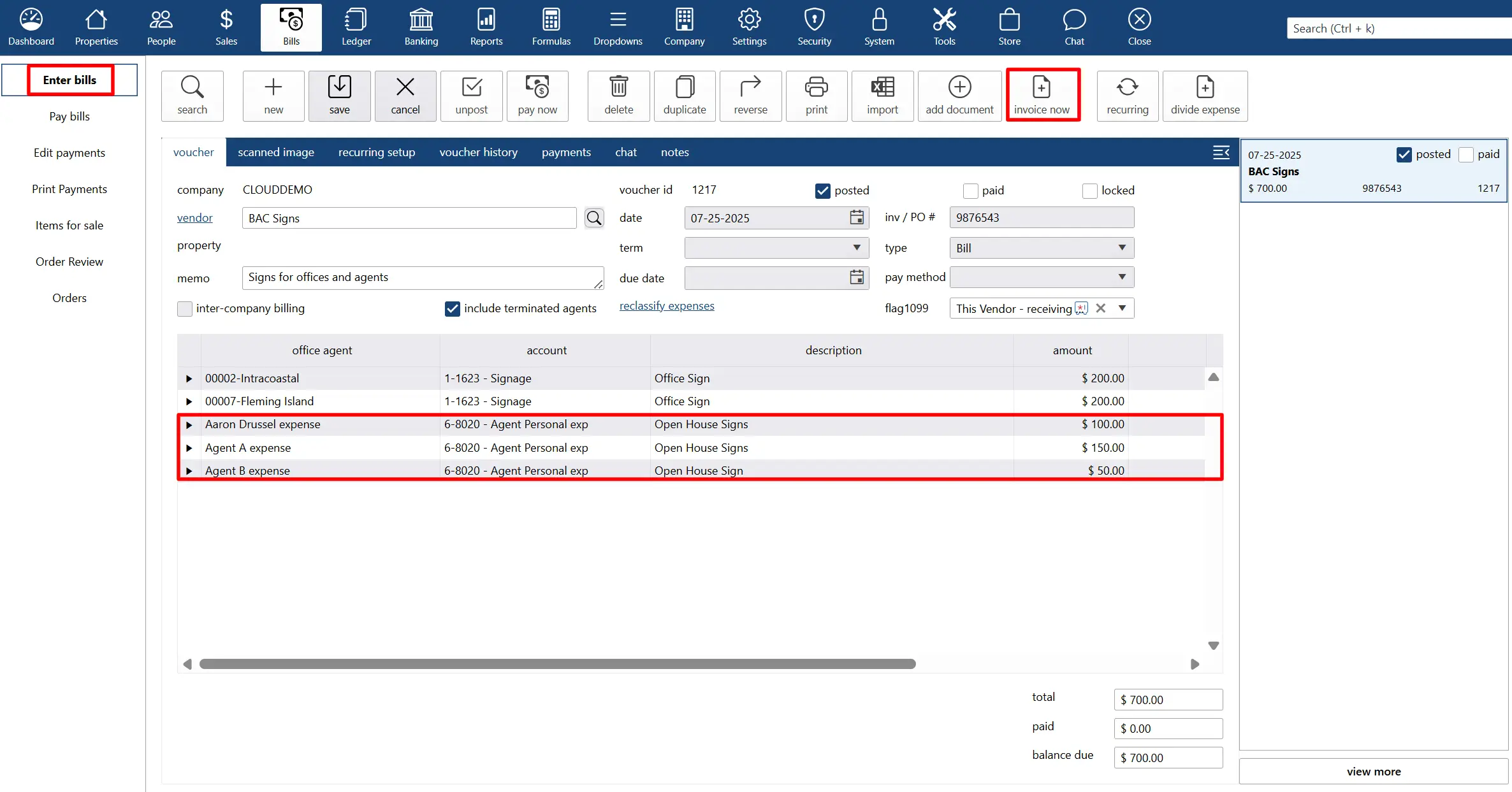
why Cloud now: reclassify feature
overview of darwin.Cloud's reclassify feature for adjusting transactions and expenses without unposting while maintaining accurate records.
why Cloud now: bankstream
overview of darwin.Cloud's bankstream feature for real-time bank account and credit card data streaming with automated financial integration.
why Cloud now: notifications and campaigns
overview of darwin.Cloud's notifications and campaigns for enhanced client communication, automated outreach, and marketing effectiveness.
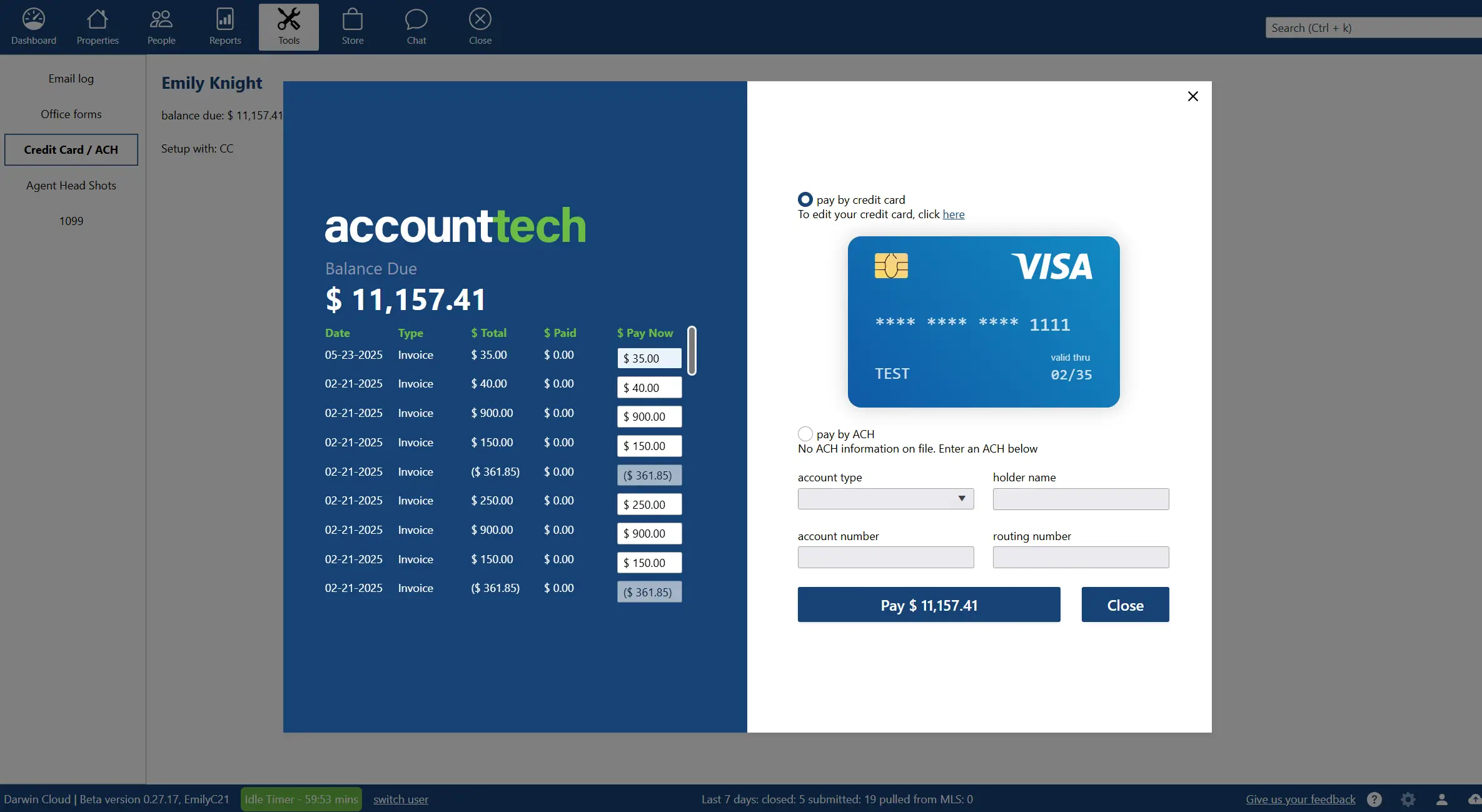
why Cloud now: agent bill pay
overview of darwin.Cloud's agent bill pay for streamlined expense management, automated payments, and enhanced agent financial services.
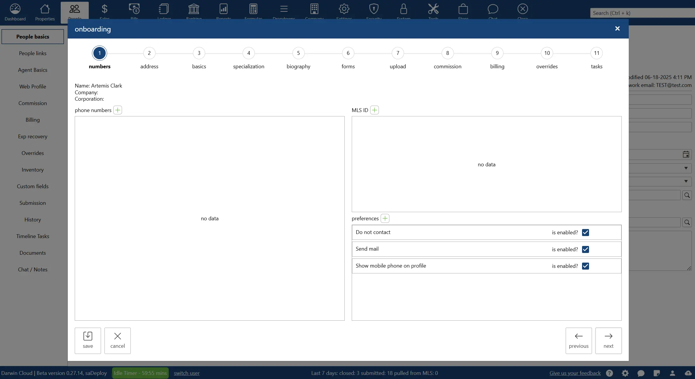
why Cloud now: agent on-boarding wizard
overview of darwin.Cloud's agent on-boarding wizard for simplified new agent setup, streamlined hiring processes, and accelerated productivity.
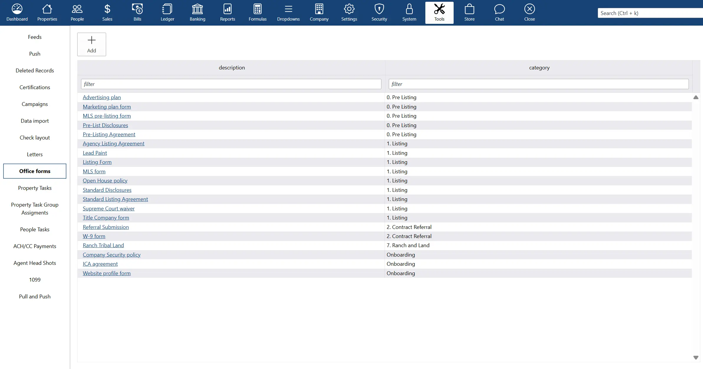
why Cloud now: office forms library
overview of darwin.Cloud's office forms library for organized document management, centralized form access, and improved operational efficiency.
why Cloud now: chat and notes
overview of darwin.Cloud's chat and notes features for enhanced team communication, improved collaboration, and streamlined coordination.
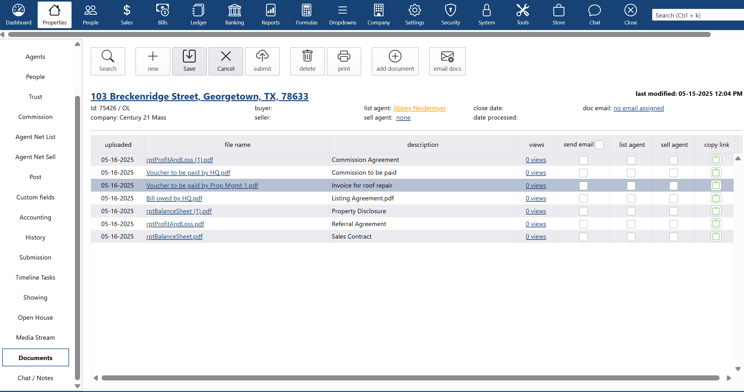
why Cloud now: document storage
overview of darwin.Cloud's document storage features for secure file management, organized document access, and improved record keeping.
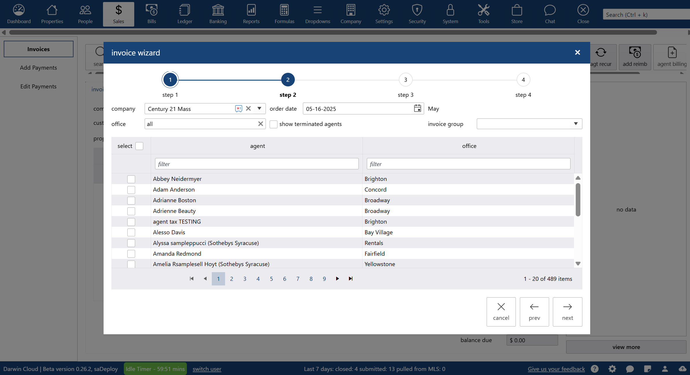
why Cloud now: agent billing
overview of darwin.Cloud's agent billing features for streamlined billing processes, automated calculations, and improved accuracy.
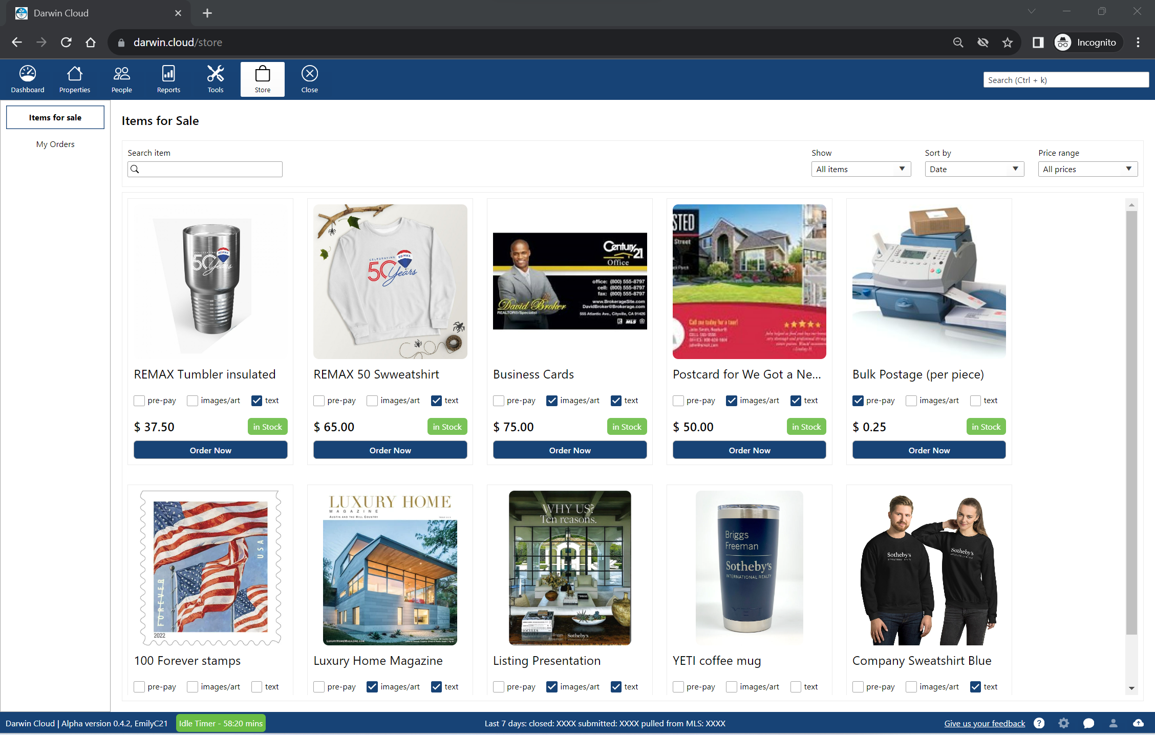
why Cloud now: company store
overview of darwin.Cloud's company store for selling products and services to agents while generating additional revenue streams.

why Cloud now: agent portal
overview of darwin.Cloud's agent portal for self-service access to statements, documents, tools, and enhanced agent satisfaction.
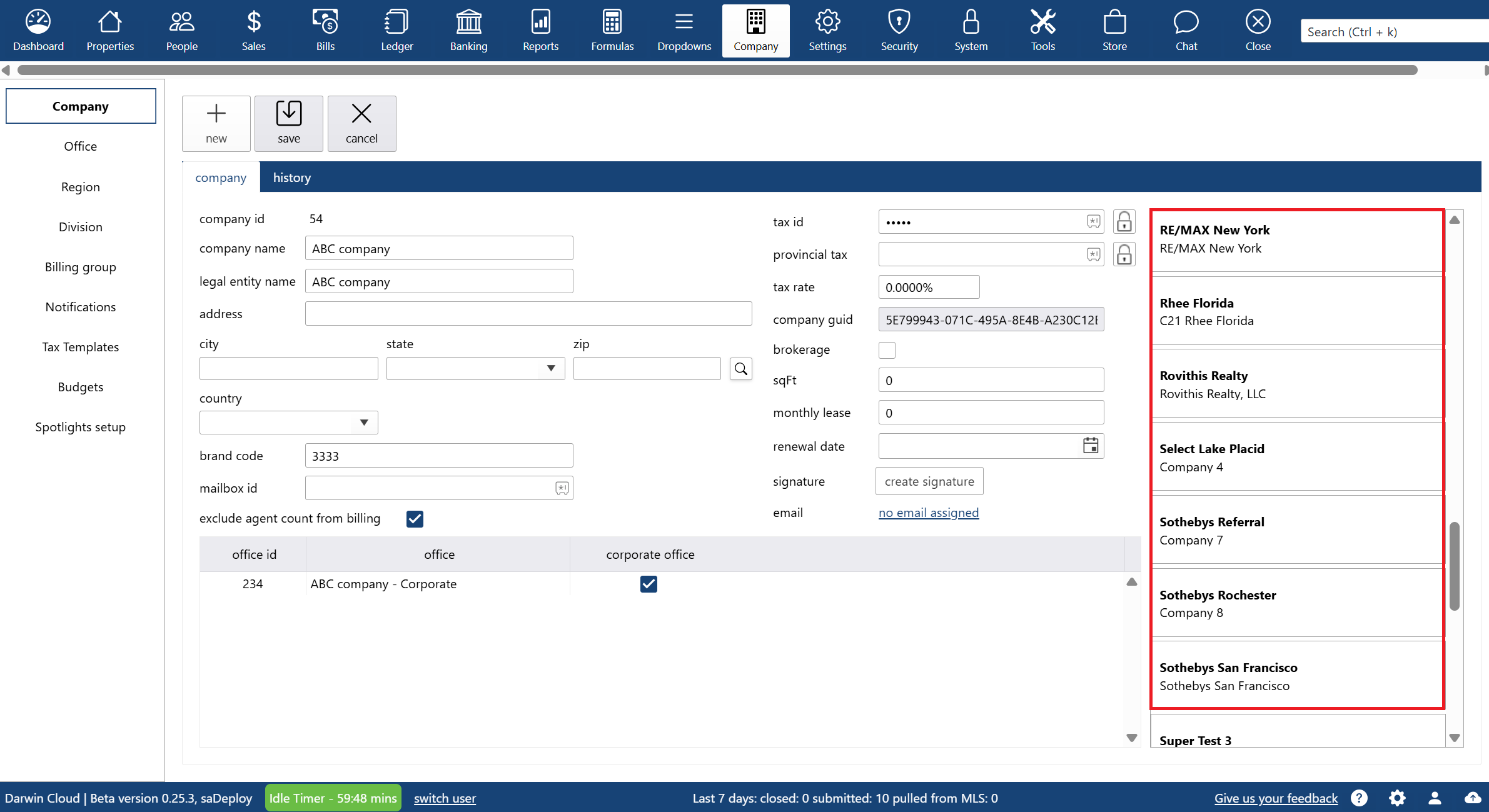
why Cloud now: multiple legal entities in ONE system
overview of multi-tenant accounting capabilities in the darwin.Cloud software for real estate and related businesses.
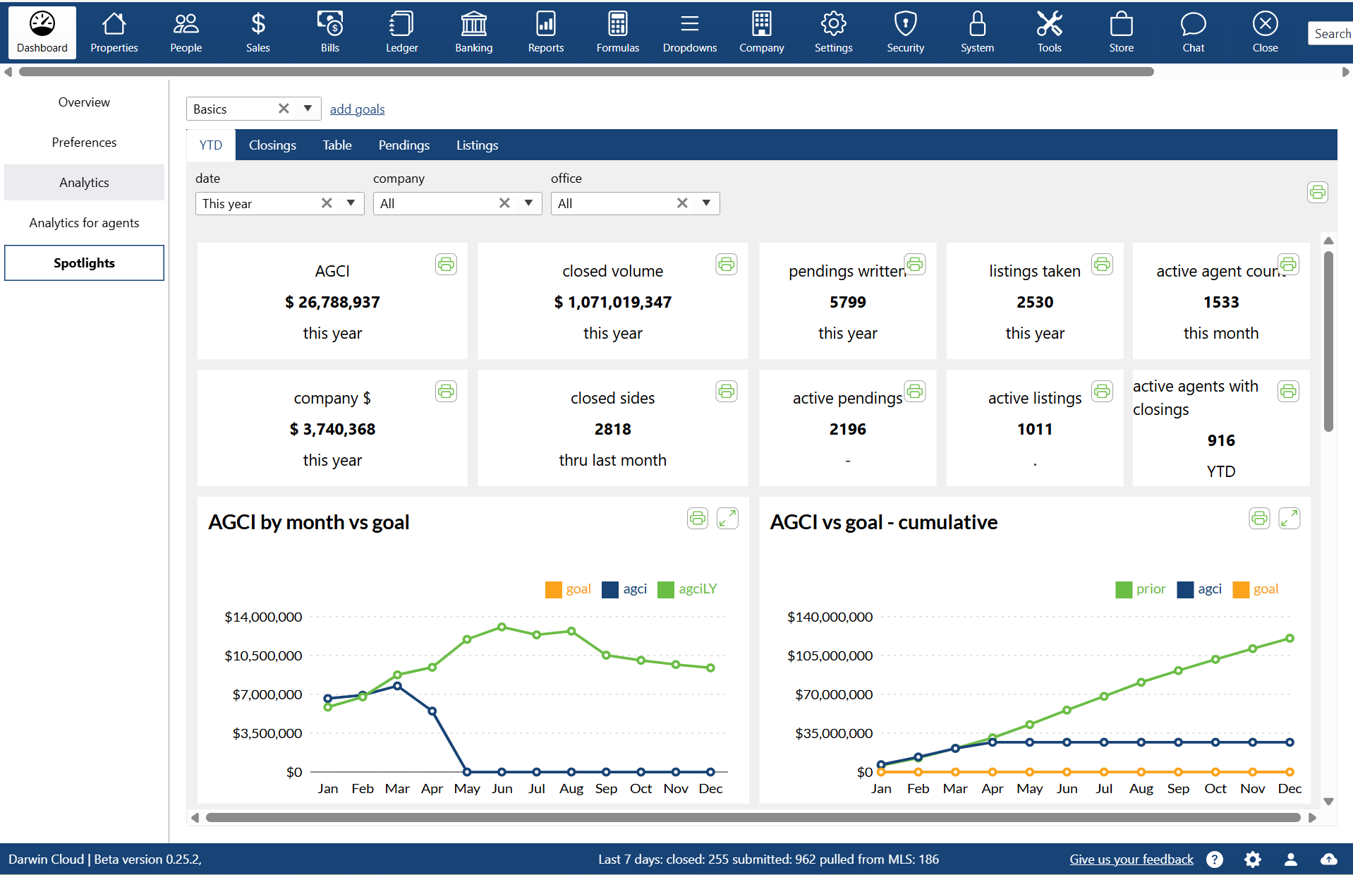
why Cloud now: spotlights
overview of darwin.Cloud's spotlights feature, including types of spotlights, customization options, and use cases.
why Cloud now: multi company
overview of darwin.Cloud's multi-company capabilities for running multiple real estate companies in one platform with seamless access.
why Cloud now: integrations with other software
overview of darwin.Cloud's integrations with other software for seamless workflow connectivity, eliminated duplicate data entry, and enhanced operational efficiency.

behind the scenes: the story behind darwin.Cloud
while working together to finish darwin.Cloud, Mark Blagden, CEO of AccountTECH and Helkyn Coello, VP of Development recorded a series on conversations about the design & building of darwin.Cloud. this is their conversation about the long road to building darwin.Cloud.
why Cloud now: company store sell and bill
a look behind the scenes at the programming behind darwin.Cloud. this hackathon project lets you keep track of everything you sell to agents. agents can buy from you online - and the invoicing and collections is automatic.

you're not losing agents—you're just paying them wrong
manual commission workflows hurt retention. see how automation drives ROI, reduces errors, and keeps agents from walking out the door.

growth will break your real estate brokerage—unless you fix these 4 things first
scaling brings complexity. learn how AccountTECH helps real estate brokerages eliminate payout errors, reduce risk, and lead with visibility.

finding the perfect real estate accounting software in 2025
real estate accounting software built to automate commissions, ensure compliance, and provide real-time insights to help your brokerage grow.

protect your data with real estate software security solutions
discover how to protect your brokerage with real estate software security best practices. learn about AccountTECH’s advanced tools to safeguard sensitive data and ensure compliance.
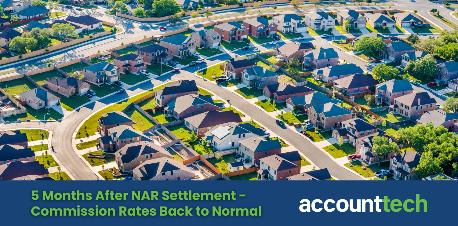
5 months after NAR settlement - commission rates back to normal
AccountTECH study finds real estate commission rates recovering by the fifth month post-NAR settlement, with seller rates slightly increasing.

AccountTECH company dollar study: are top producing agents really worth it?
discover how top-decile agents drive higher company dollar retention for brokerages, with insights from AccountTECH's latest study on agent performance.

real estate reporting tools empower data-driven decisions
unlock smarter decisions with AccountTECH’s darwin platform. learn how real estate reporting tools transform data into actionable insights, streamline workflows, and drive success.
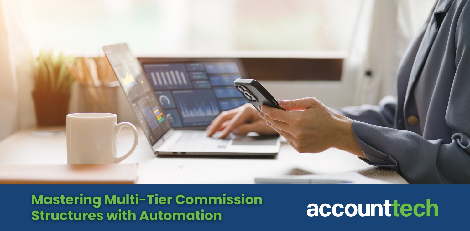
mastering multi-tier commission structures with automation
master multi-tier commissions with AccountTECH’s darwin.Cloud platform. automate calculations, ensure compliance, and boost agent satisfaction.

enhancing brokerage efficiency with MLS and CRM integration
streamline your real estate operations with AccountTECH’s MLS and CRM integration tools. discover how darwin.Cloud improves efficiency, enhances collaboration, and boosts client service.

master real estate commission payouts with AccountTECH
simplify commission payouts and compliance with AccountTECH’s automated software. boost accuracy, save time, and strengthen agent trust.

5 ways real estate back office software boosts holiday workflows
discover how real estate back office software streamlines holiday workflows with automation, MLS and CRM integrations, and year-round compliance tools.

real estate CRMs strengthen client relationships and drive sales
explore how real estate CRMs strengthen client relationships, automate follow-ups, and drive sales for brokerages focused on growth.
mid-sized real estate brokerages show 10x higher PPP
AccountTECH announces the release of its latest white paper: production per person (PPP) analysis of agent by quartiles — insights into efficiency and agent roster composition.

how real estate back office software streamlines operations
discover how real estate back-office software like darwin.Cloud streamlines operations, automates commissions, ensures compliance, and supports growth.

AccountTECH announces top 10 companies gross commission per agent 3Q 2024
AccountTECH's latest analysis reveals the top 10 U.S. real estate companies with the highest AGCI per agent in 2024, highlighting traits of high-performer brokerages.
AccountTECH report finds little change in commission rate since NAR settlement
AccountTECH’s study on the NAR Settlement’s impact finds minor changes to real estate commission rates but signals a drop in buyer-side transactions.

5 key benefits of using real estate specific accounting software
discover 5 key benefits of using AccountTECH’s real estate specific accounting software to streamline finances, enhance accuracy, and support growth.

essential software solutions for real estate brokerages
from tracking commissions to nurturing client relationships, the right real estate software can streamline essential tasks and empower brokerages to work more efficiently.
Mark Blagden from AccountTECH talks about the features in Project Management software Shaker.io
AccountTECH CEO Mark Blagden announces the Shaker.io acquisition, sharing why its design and project management tools are a valuable addition to darwin.Cloud.
CEO Chris Lucas talks about the key features in Shaker and workflow management
Shaker.io CEO Chris Lucas highlights Shaker’s key features for managing relationships and workflows, enhancing real estate transaction efficiency and client engagement.
AccountTECH acquires transaction management platform Shaker.io
AccountTECH acquires Shaker.io, enhancing real estate client value with advanced transaction management, automation, and seamless communication tools.

outsource labor cost prices for real estate brokerages
AccountTECH conducted a nationwide survey of prices for outsourced accounting services for Real Estate brokerages. Here is what they found.

AccountTECH labor cost study for real estate brokerages 2024
AccountTECH has released a benchmark report detailing labor costs for the first six months of 2024. The analysis reveals that the average labor cost per transaction surpassed $900.
creating the real estate vertical - a new approach
For over 20 years, the “holy-grail” in Real Estate software engineering has been the “all-in-one” real estate vertical. Sometimes referred to as an “operating system” for Real Estate, the idea is to build a single application that provides a software solution for every stage of the real estate sales process.

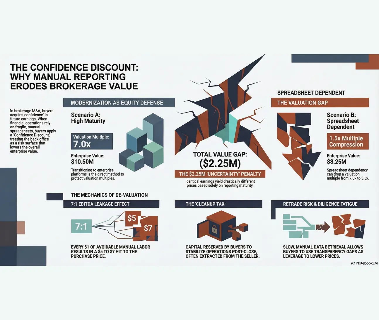
Profitability in an era of post-NAR settlement declining commission percentages
AccountTECH study examines brokerage profitability impact when commission rates drop below 6% due to NAR settlement changes nationwide.

modest gains as more real estate brokerages turn profitable by mid-year 2024
A new study reveals a slight improvement in the number of profitable brokerages in the first half of 2024 compared to the previous year.

spotlight to stay on-track
darwin.Cloud - run your brokerage from your phone. With darwin mobile, you can manage cash, pay your bills, check your budgets and message with everyone ... all from your phone.

darwin.Cloud unveiled at T3 Leadership Summit
AccountTECH is moving online and upstream. AccountTECH, a trailblazing innovator of accounting software solutions for brokerages and franchisors , announces the launch of the industry's first and only cloud-based enterprise accounting software.

introducing darwin.Chat
darwin.Chat is a breakthrough technology that lets users communicate via text message from inside darwin.Cloud

spotlight: 1st 100 days
Spotlight new Recruits success towards getting paid in the 1st 100 days

spotlight: income vs profit per agent
Total Income per Agent numbers are helpful - but they're not the whole story. We need to see agent income compared to the overhead in the office where they work.
spotlight security: setup unique spotlights for each role in your company
Controlling Spotlight visibility. Spotlights allow you to set visibility of specific Spotlights to specific roles in your company.
spotlight analytics: income vs budget
KPI Spotlight: Income vs Budget. Spotlights are the newest and best way to see how your company is performing. Using a collection of key performance indicators, you can quickly see Income by month or cumulatively thru the year and how it compares to budget.
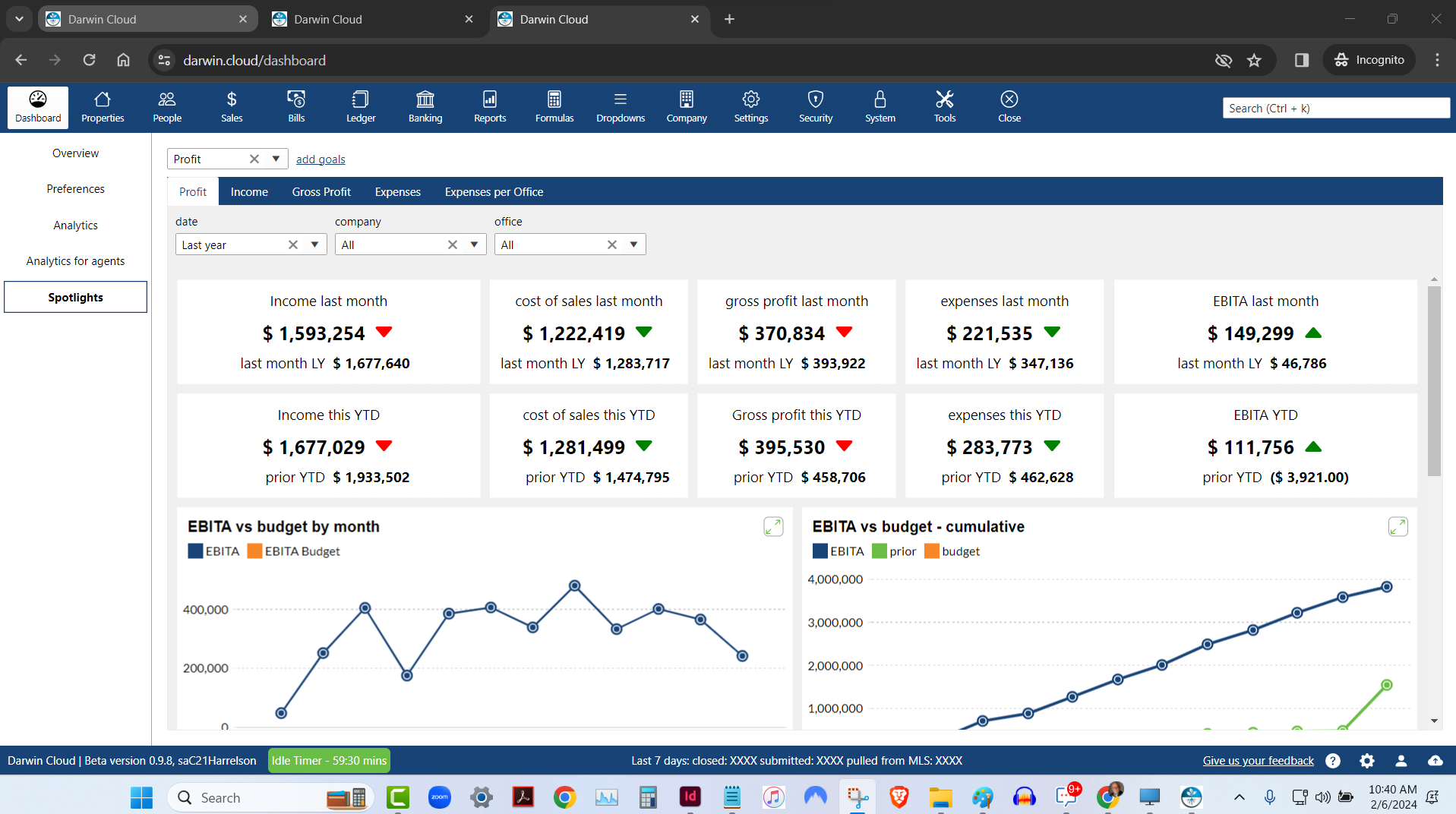
spotlight analytics: profit & loss
KPI Spotlight: Profit & Loss. Spotlights are the newest and best way to see how your company is performing. Using a collection of key performance indicators, you can quickly see Profit for last month and Year to date compared to the prior year.
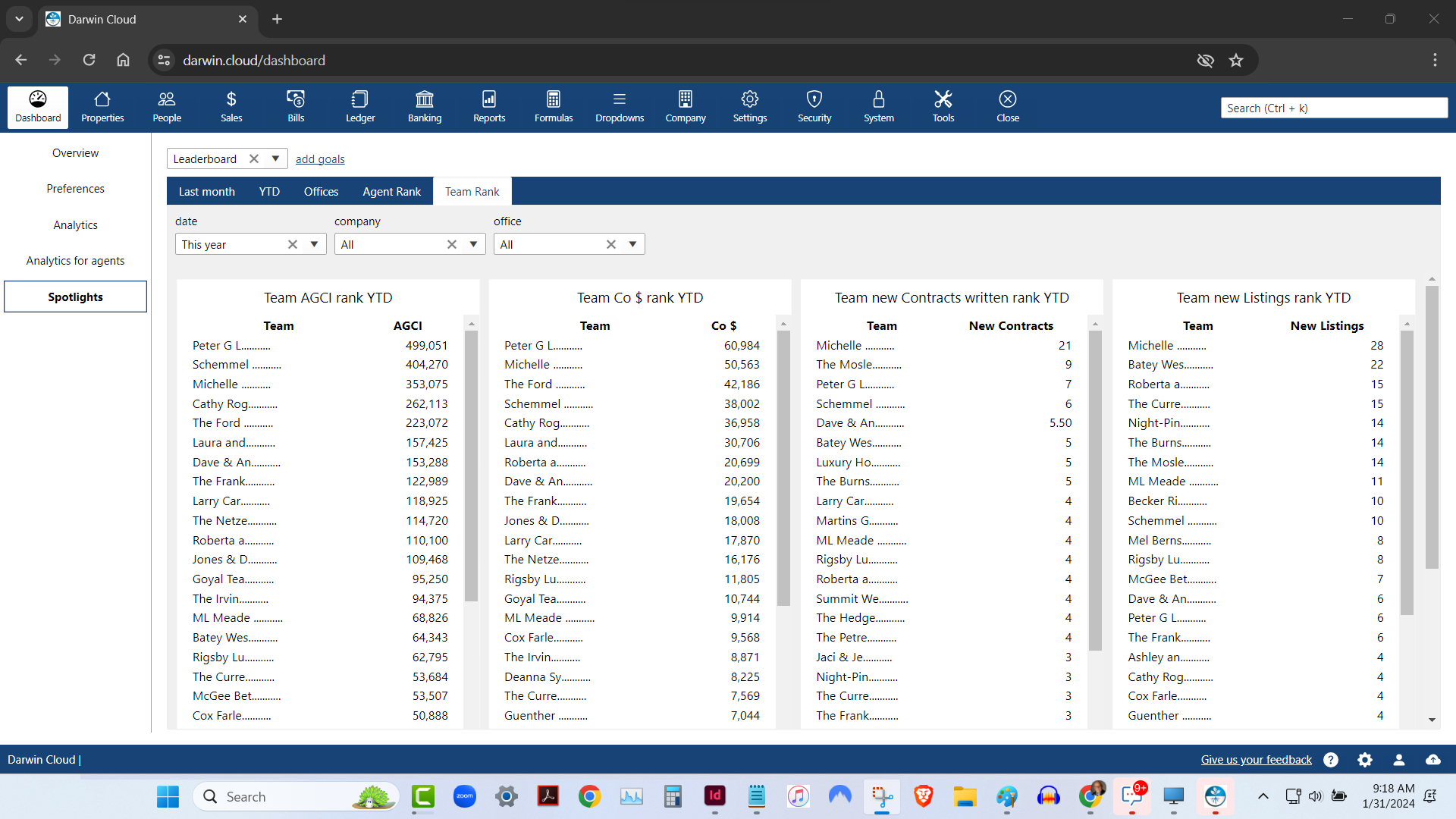
spotlight analytics: team rank leaderboard
KPI Spotlight: Team Rank Leaderboard. Spotlights are the newest and best way to see how your company is performing. Using a collection of key performance indicators, you can quickly see which of your Teams is performing best - based on 4 essential KPI.
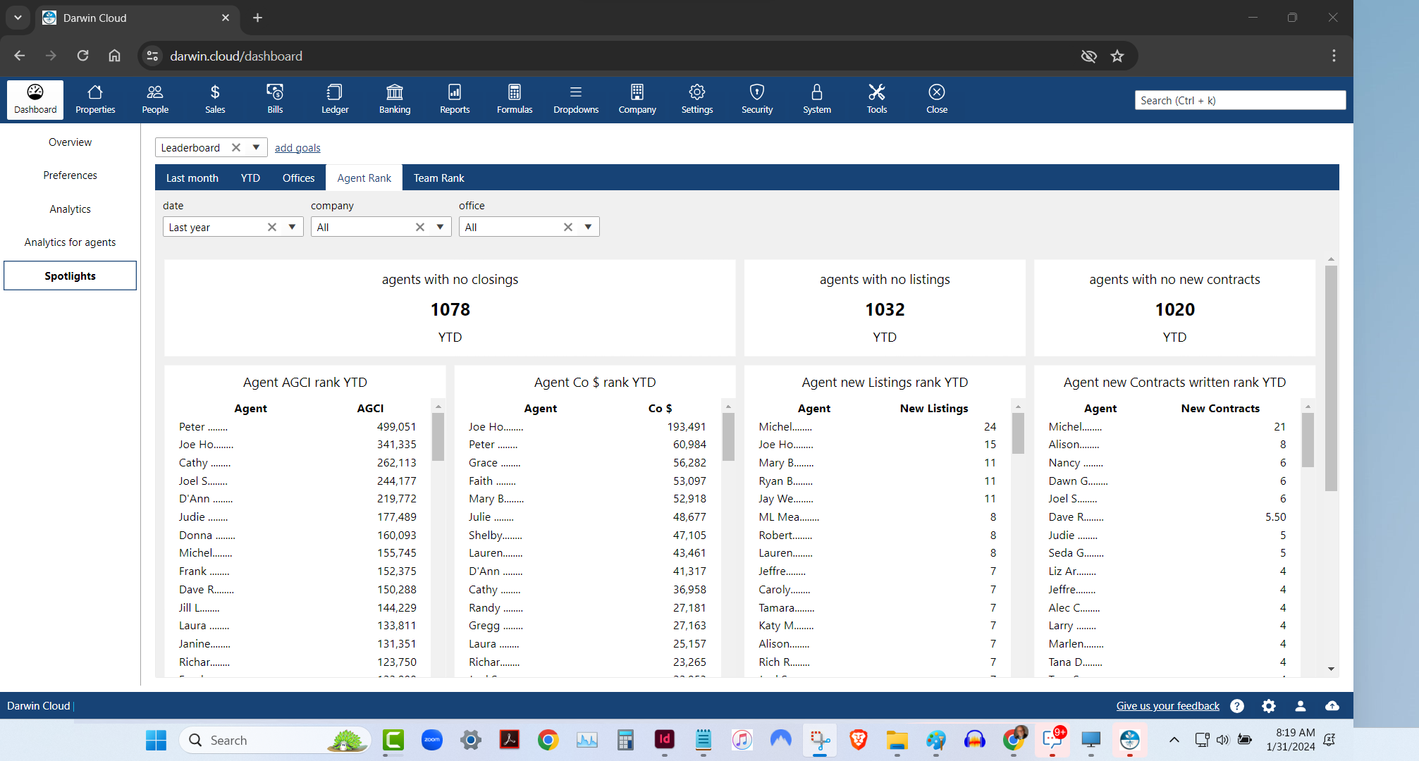
spotlight analytics: agent rank leaderboard
KPI Spotlight: Agent Rank Leaderboard. Spotlights are the newest and best way to see how your company is performing. Using a collection of key performance indicators, you can quickly see which of your Agents are performing best - based on 4 essential KPI.
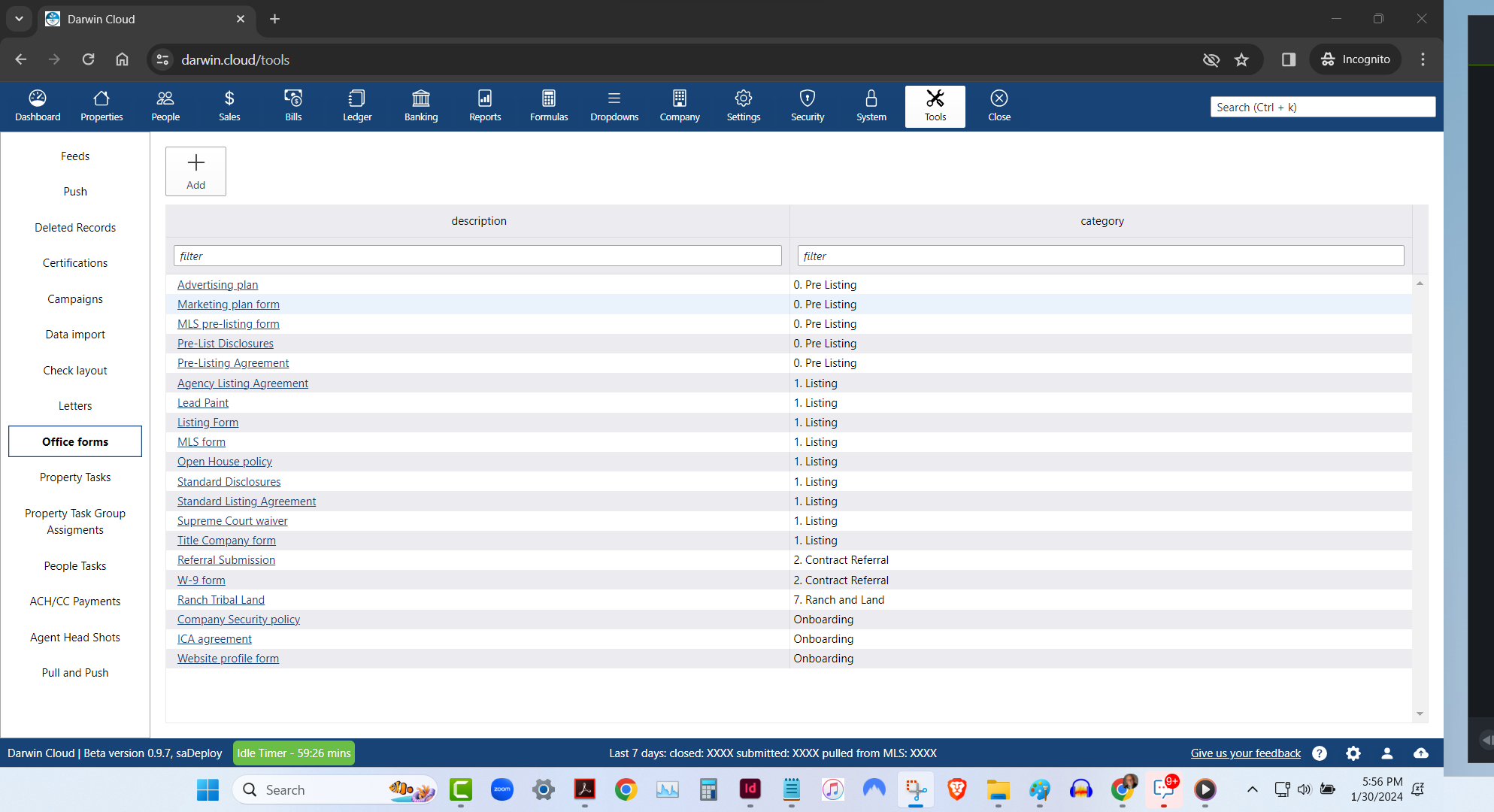
new darwin.Cloud feature: office forms library
store all the forms your agents need in the office forms library
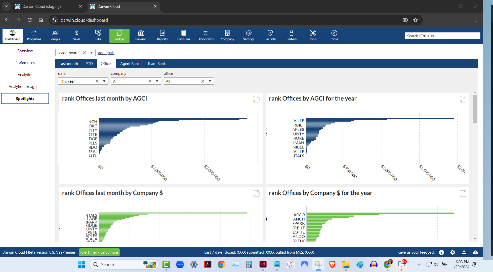
spotlight analytics: office rank leaderboard
KPI Spotlight: Office Rank Leaderboard. Spotlights are the newest and best way to see how your company is performing. Using a collection of key performance indicators, you can quickly see which of your offices are performing best - based on 6 different metrics.
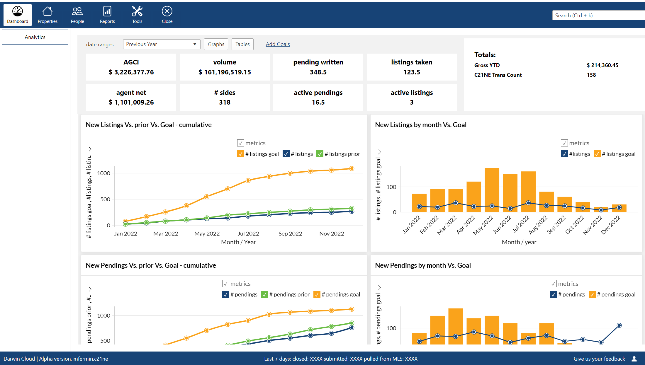
New darwin.Cloud feature: Customized Agent dashboards
personalize agent dashboards in darwin.Cloud with customizable widgets and KPIs. empower agents with tailored insights for performance tracking.
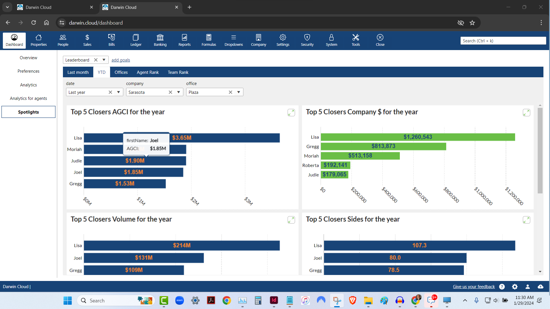
spotlight analytics: top 5 agent leaderboard
KPI Spotlight: Top 5 Agents Leaderboard. Spotlights are the newest and best way to see how your company is performing. Using a collection of key performance indicators, you can quickly see the Top 5 Agents based on 6 different metrics.
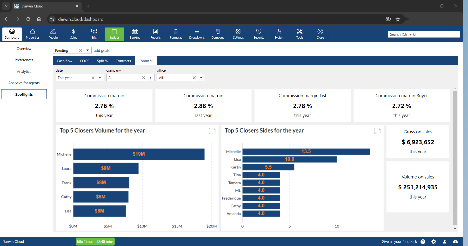
spotlight KPI: commission margins
KPI Spotlight: New Contracts written. Spotlights are the newest and best way to see how your company is performing. Using a collection of key performance indicators, you can quickly see the Commission percentages your agents are charging to Buyers and Sellers.
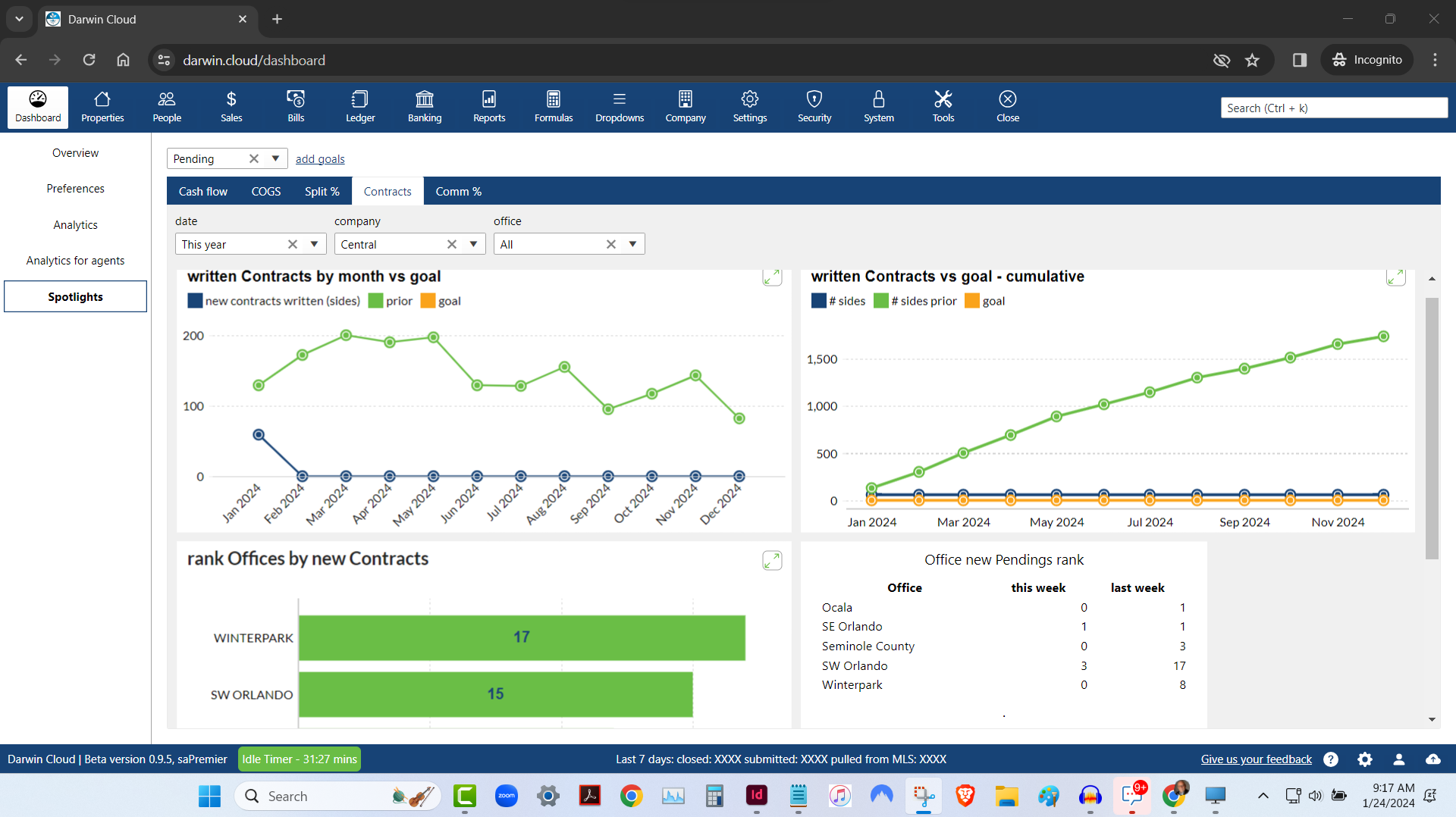
spotlight KPI: new contracts written
KPI Spotlight: New Contracts written. Spotlights are the newest and best way to see how your company is performing. Using a collection of key performance indicators to see how many new Contracts your agents are writing.
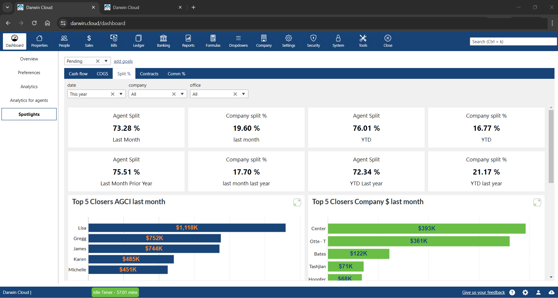
spotlight KPI: commission split percentages
KPI Spotlight: Commission split percentages. Spotlights are the newest and best way to see how your company is performing. Using a collection of key performance indicators to see what percentage your company has paid in split percentages last month and Year to Date.
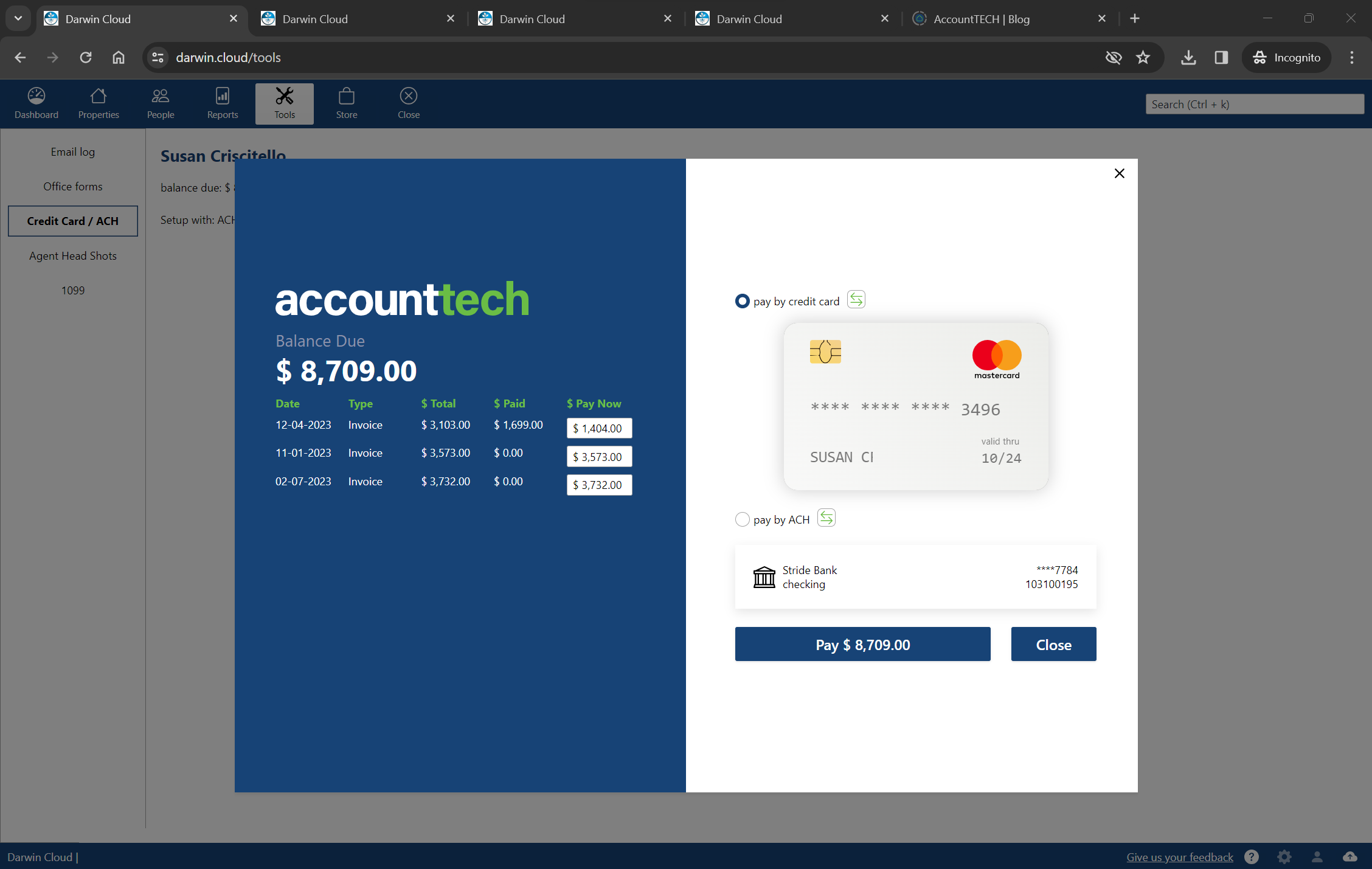
NEW darwin.Cloud feature: agent bill pay
darwin.Cloud now enables agents to pay their bills real-time, on-demand in darwin.Cloud. when an agent wants to "settle-up", they can pay by credit card or ACH.

spotlight KPI: pending cost of goods sold
KPI Spotlight: cost of goods sold. Spotlights are the newest and best way to see how your company is performing. Using a collection of key performance metrics, you can quickly get to critical information that drives your company's success.
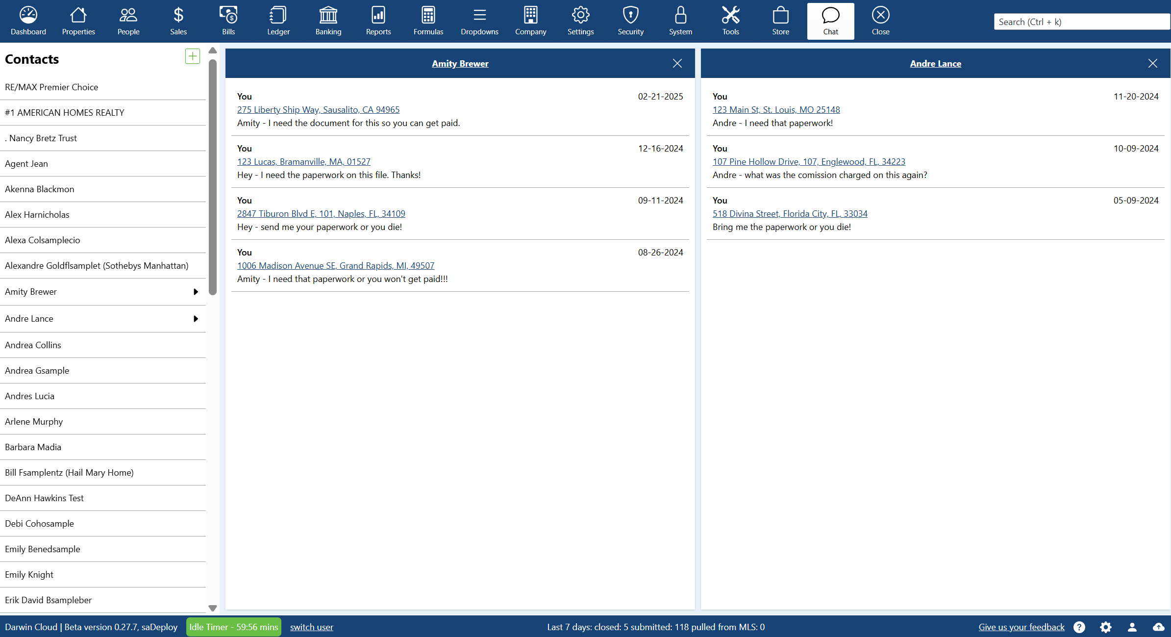
NEW darwin.Cloud feature: agent email history
darwin.Cloud now deliivers email campaign copies to agents. when an agent needs a copy of a commission statement, invoice statement or hot sheet - they will find them all in their campaign history.
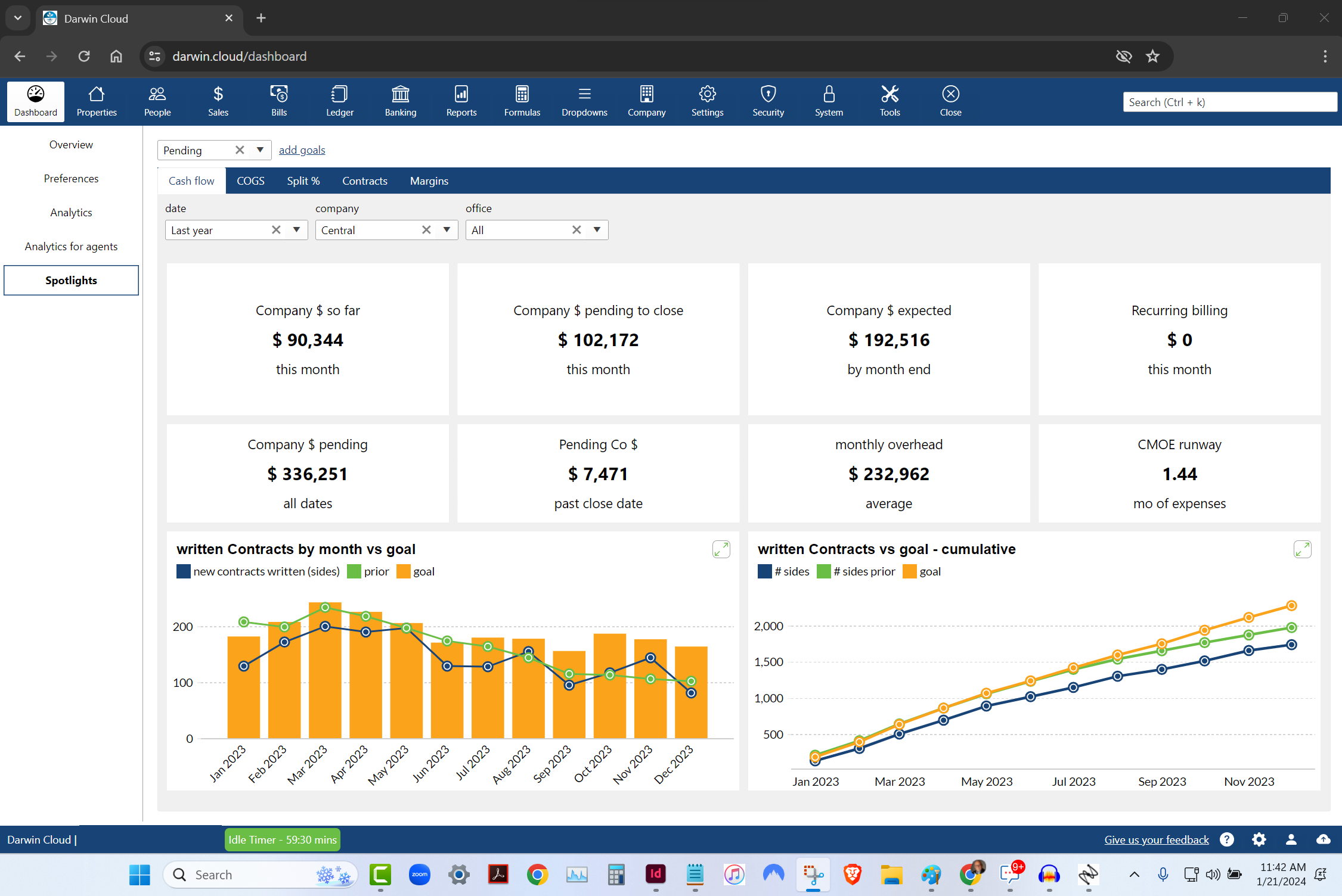
spotlight KPI: pending cash flow
KPI Spotlight: cash flow. Spotlights are the newest and best way to see how your company is performing. Using a collection of key performance metrics, you can quickly get to critical information that drives your company's success.

behind the scenes: EOS analytic spotlights
While working together to finish darwin.Cloud, Mark Blagden, CEO of AccountTECH and Helkyn Coello, VP OF Development recorded a series on conversations about the design & building of darwin.Cloud. This is their conversation about: EOS style scorecards and Analytic Spotlights

NEW tools in darwin.Cloud for agents
there's alot for agents in the new darwin.Cloud. some of the tools are to help the agents be more successful. Some of the tools are to help sales managers help the agents. and other tools are designed to save the back office and accounting staff time.

NEW darwin.Cloud feature: create expense rules by billing group
darwin.Cloud now has enhanced automation that enables you to more accurately allocate expenses that stream into darwin daily.

NEW darwin.Cloud feature: create complex rules for expense classification automation
create complex rules that enable darwin.Cloud correctly allocate bank & credit card charges.

NEW darwin.Cloud feature: Connect your credit cards to darwin.Cloud
connect your credit cards to darwin.Cloud so you can have darwin automatically classify your credit card charges.

NEW darwin.Cloud feature: Agents print their own 1099
agents can print their own 1099 for this year - and any prior years! now the staff is free from the burden of printing, stuffing envelopes & mailing 1099s to agent
NEW darwin.Cloud feature: agent goals analytics
track and analyze agent goal performance with darwin.Cloud's analytics tools. monitor progress, set targets, and drive agent success with insights.

behind the scenes: bank stream
While working together to finish darwin.Cloud, Mark Blagden, CEO of AccountTECH and Helkyn Coello, VP OF Development recorded a series on conversations about the design & building of darwin.Cloud. This is their conversation about: streaming Bank account & Credit card data

Quickbooks replacement tech part 2: expense allocation
darwin.Cloud automatically allocates incoming payments across all your offices.

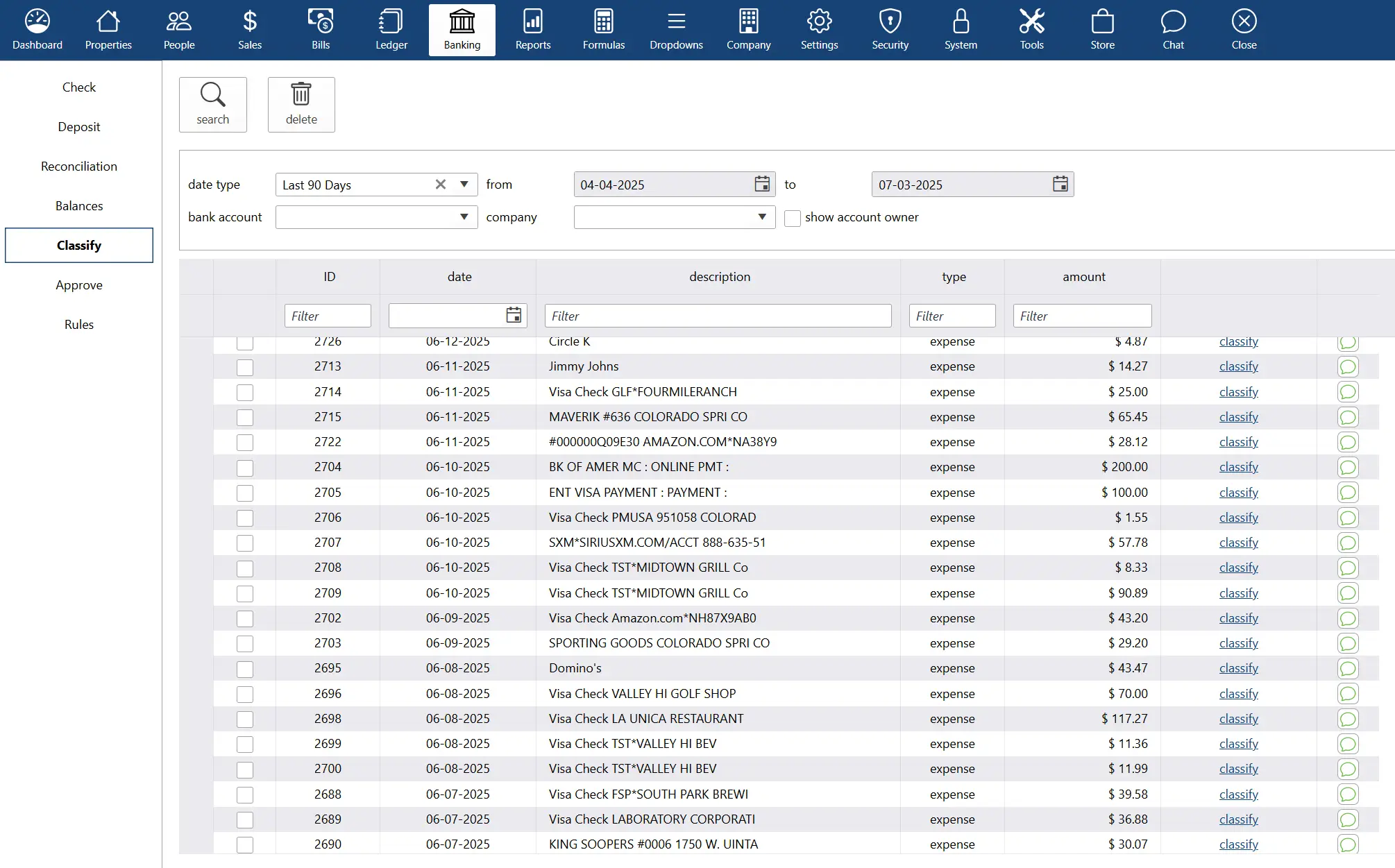
Quickbooks replacement tech part 1: streaming bank data
darwin.Cloud now has enhanced automation that streams bank and credit card activity into darwin. This technology saves time & enables you to much more accurately classify payments that stream into darwin daily.
NEW darwin.Cloud feature: company store
introducing the company store in darwin.Cloud for selling products and services to agents. streamline internal commerce and generate revenue.

darwin.Cloud profit per agent - it's more than just commission split
track individual agent profitability with darwin.Cloud's profit per agent analytics. analyze performance, costs, and revenue for decisions.
NEW darwin.Cloud feature: automatic bank reconciliations
automate bank reconciliation processes with darwin.Cloud. eliminate manual reconciliation work and improve accounting accuracy and efficiency.

NEW darwin.Cloud feature: enhanced accounting summary screen
access enhanced property accounting summary screens in darwin.Cloud. get comprehensive transaction overviews and improved financial visibility.

NEW darwin.Cloud feature: reclassify journal entries without unposting
reclassify journal entries in darwin.Cloud without unposting transactions. maintain accurate records while preserving audit trails.
NEW darwin.Cloud feature: import your bills from Excel
import bill data directly from Excel into darwin.Cloud. streamline data entry, reduce errors, and accelerate accounts payable processing.

NEW darwin.Cloud feature: import credit card charges
import credit card charges directly into darwin.Cloud for automated expense tracking. simplify reconciliation and improve financial accuracy.

NEW darwin.Cloud feature: import payroll
import payroll data seamlessly into darwin.Cloud. automate payroll processing, reduce manual entry, and ensure accurate employee compensation.